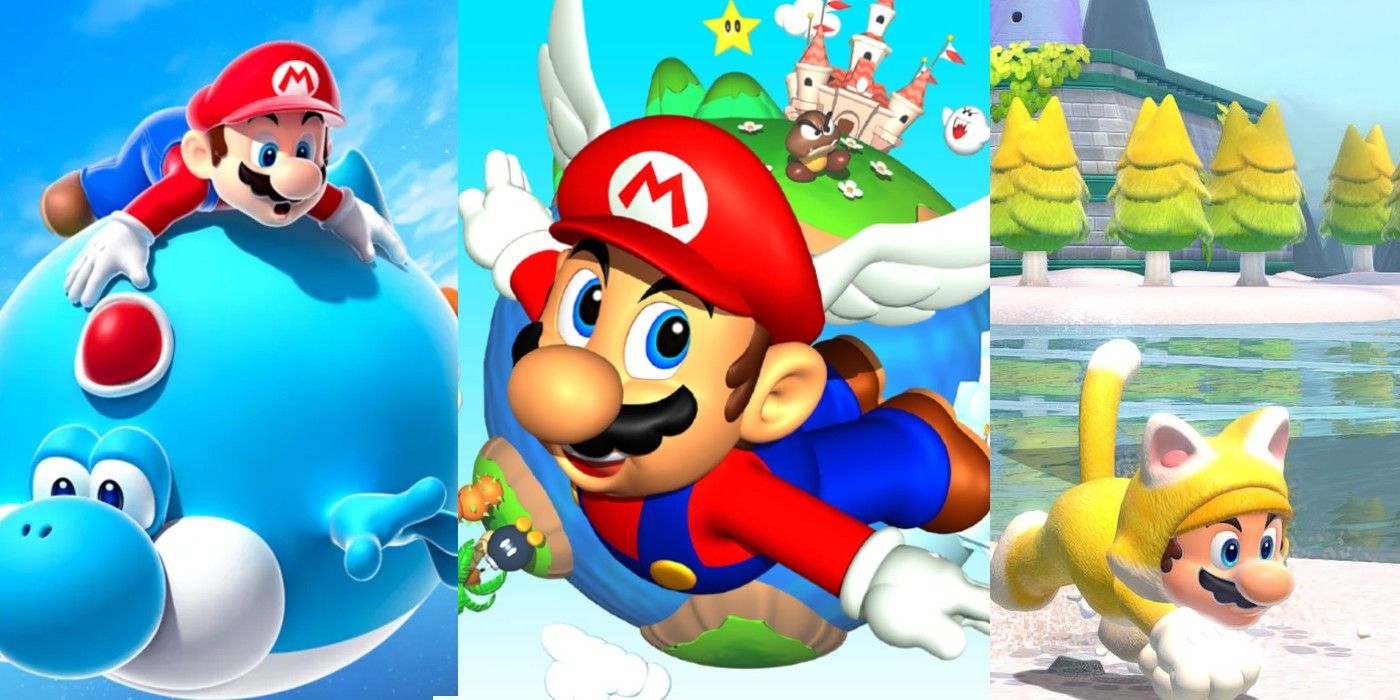
In a similar fashion to Disney’s Mickey Mouse, Nintendo mascot Mario’s design has changed many times over the years. Mario games vary in theme and aesthetic, which is especially true of the popular 3D Mario games. It’s fun to take a look back at each of these games and witness the character’s changes, gradually morphing into the Mario he is today. However, which of the 3D Mario games has the best design for its titular plumber?
The first 3D Mario was Super Mario 64, which hit store shelves in 1996. The game was an instant hit then and a fan-favorite today. It helped revolutionize 3D gaming, inspired many 3D platformers, and is respected and revered by fans and developers alike. Since the Nintendo 64, at least one 3D Mario game has been released on every Nintendo home console, and they’re each high-quality titles worthy of bearing Nintendo’s mascot on the cover. Some of them may not be as popular as others, but they each portrayed Mario differently enough, both aesthetically and in gameplay, for preferences to be had.
Click the button below to start this article in quick view.
There are seven main 3D Mario games in the series, but some of them use such similar styles to each other that they’ve been bunched together for this list. For example, Super Mario Galaxy and Super Mario Galaxy 2 have basically the same design for the protagonist as each other. That said, here are each of Mario’s designs from the 3D Mario, games ranked from worst to best.
#5 Super Mario 64 – Worst 3D Mario Character Design
It’s impossible to deny Super Mario 64‘s design is an absolute classic. It’s one of the most distinct designs on this list, but that’s mostly because Nintendo’s character designs, in general, had a unique vibe during the Nintendo 64 era. The design doesn’t look bad, but it does look dated. Mario is overall less vibrant and whimsical than his newer designs, and he’s noticeably less detailed, especially in chunky polygons of the game itself. It makes sense, of course, as Mario 64‘s Mario was likely one of the first 3D character designs Nintendo ever made. It’s still aged considerably well, and some simple, fan-made updates can make Mario 64‘s art style impress.
#4 Super Mario 3D Land & Super Mario 3D World + Bowser’s Fury
This is another great design for Mario. Super Mario 3D World‘s version obviously looks crisper than Super Mario 3D Land’s, since it runs on technically superior hardware, but the designs themselves are the same. These designs look great, but they feel a bit safe; they look like what Mario is supposed to look like and nothing more. Mario is just as bubbly and happy as ever, and there’s a clean balance between cartoon and realism in the design, as well. However, Mario is frequently depicted in his Tanuki Suit and his Cat Suit in both games, both of which could look better. His design is more prominent in Super Mario 3D Land, since there are more playable characters in Super Mario 3D World. Overall, these designs are solid, but they don’t do much to push Mario’s aesthetic forward, beyond furry suits and callbacks to retro NES games.
#3 Super Mario Galaxy & Super Mario Galaxy 2
The Super Mario Galaxy games are some of the more popular Mario titles among fans, and it’s easy to see why. Their space setting and mind-boggling anti-gravity mechanics made them stand out from other platformers on the market, and they were also graced with some excellent art direction. Colors pop off the screen at every corner, and a big part of what made these games’ aesthetic strong was their lighting. Characters seem illuminated by a bluish hue, which gives Mario a mystical glow. It’s a real shame Super Mario Galaxy 2 isn’t included in Super Mario 3D All-Stars, as it would have looked amazing with an improved resolution, just like the first game.
#2 Super Mario Sunshine
Similar to the game itself, Super Mario Sunshine‘s Mario design is easily the most distinguishable of all. Mario rocks a short-sleeve shirt for the first time, and he has F.L.U.D.D. strapped to his back, as well. Some players disliked the water mechanics in Sunshine - especially in the Switch version, before GameCube controller support was added - but it’s a major part of what makes Mario’s design unique, here. What makes this design so compelling is how bold it is compared to the others. Sunshine Mario looks cooler than he is cutesy, but he’s also unique enough to be instantly recognizable as the Mario from Super Mario Sunshine.
#1 Super Mario Odyssey – Best 3D Mario Character Design
While Super Mario 3D World played things safe in many ways, Super Mario Odyssey pushed the boundaries of what a 3D Mario game could be, and this Mario design is reflective of that. Cappy puts Mario’s iconic hat into focus, and Mario has never been this detailed outside of Super Smash Bros. Beyond that, Mario is also capable of wearing all kinds of outfits in Super Mario Odyssey, which just makes this design even more versatile. He can wear a swimsuit, cowboy gear, and even samurai armor. It’s a fantastic blend of everything that’s worked for Mario in the past, with lots of fresh ideas that make this design something special.
Mario’s design differences aren’t as drastic as characters like Link from The Legend of Zelda, but they’re still definitely noticeable. Nintendo made sure that each mainline Mario game it produced stood out from one another, not only from a gameplay perspective but from an artistic one, as well. Some titles, like Super Mario 3D Land and 3D World, share art styles, but they’re still distinct enough to tell the difference. Regardless, Nintendo has done a great job making sure all of the 3D Mario character designs are unique and loveable, as is fitting for the company’s most iconic mascot.
About The Author
