This content contains affiliate links. When you buy through these links, we may earn an affiliate commission.
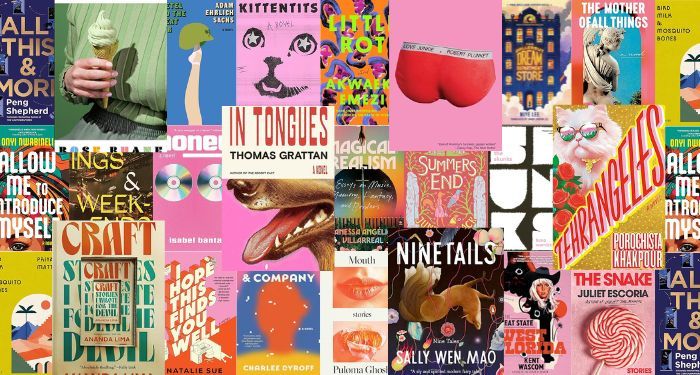
In April, I rounded up some of the best book covers of 2024 so far. Those were for books that published between January and the end of April. Now it’s time to revisit that roundup, but this time, it’s for books that published between May and the end of July. All of these books are available now for your reading and cover-appreciating needs.
Book cover design is interesting because it’s got to play to some trends, got to play to some conventions of genre and age category, and because it’s got to play to consumer tastes. We need book covers to sell a book — it’s the number one marketing opportunity for any title. But we need those covers to also give insight into the story and to be nice to look at and to be easy to render on mobile.
Important to all of this is the team behind the cover’s creation. For too long and still to this day, cover designers and artists are rarely credited for their work. The time it takes to find this information is embarrassing in 2024, and still, many of the covers you’ll see below don’t have this information available. Publishers still don’t put it on the landing pages for these books, so it takes good Googling and a lot of luck to dig up names to credit. Unfortunately, this also makes it easier for AI-generated art to get through to book covers, which we have already seen this year.
In this second best covers roundup, I’ve done my best to credit artists and designers, and those without are not left off as a slight. For the sake of space, time, and, well, because this is a post about book covers and not necessarily the book contents, I’ve not posted descriptions of the books but short thoughts on what makes the cover stand out. You can grab the book description by clicking the link.
These covers are only for adult fiction (and this roundup has a couple of works of adult nonfiction, too). There are certainly whole posts with more rad covers for YA books and middle grade books and children’s books, and so on.
More of the Best Book Covers of 2024 So Far
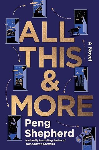

All This and More by Peng Shepherd
This is such a fun and clever cover. You know this is going to be a fantastical read because of what you get to peep inside each of the open doors, but you’re also left intrigued because those arrows don’t point in logical directions. It gives literary fantasy vibes in the best way.
(As an aside: I read a lengthy page of details about this book on the publisher’s page but there’s not one mention of the team behind the cover art—why is this still acceptable to leave out? This isn’t a call out to this specific publisher, as this was the case for several books in this roundup).
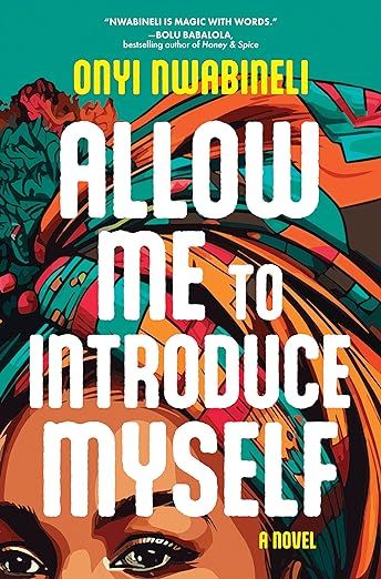

Allow Me To Introduce Myself by Onyi Nwabineli
The US cover here is quite different from the UK edition, though it still holds onto its bold color and vibrant energy. The neon yellow carries into the author’s name, and though we cannot see the expression on the person’s face here, we can surmise it’s similar to the one on the other edition.
The eyes peeking out from beneath the title-focused design give both the font and the design equal weight.
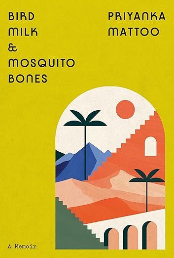

Bird Milk & Mosquito Bones by Priyanka Mattoo, cover design by Linda Huang, cover illustration by Noémie Cédille
Though there is a distinct vintage vibe to this cover, there is also a very modern feel to it, too. There’s a nice balance in where the title is placed in relation to the author’s name and in relation to the art itself. Bird Milk & Mosquito Bones does something unique in being maximal in its minimalism.
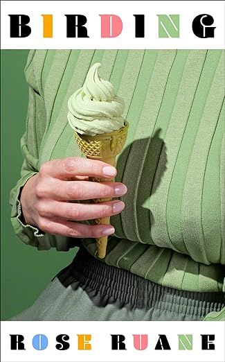

Birding by Rose Ruane, Cover design by Charlotte Stroomer, photography by Kelsey McClellan
From the placement of the title and author name with their mixing of black and colorful font to the vintage-inspired image in an understated green, this cover stands out because it is startlingly simple. I not only want to devour that ice cream cone—it’s got to be pistachio in that color, right?—but it succeeds in making me want to read the book.
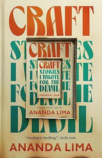

Craft: Stories I Wrote for the Devil by Ananda Lima, cover design by Jamie Stafford-Hill
How clever is this matryoshka doll-style book cover? The play off the book’s title, Craft, elevates it from simply clever to very memorable (and the light burn marks at the bottom a nod to the devil is *chef’s kiss*).
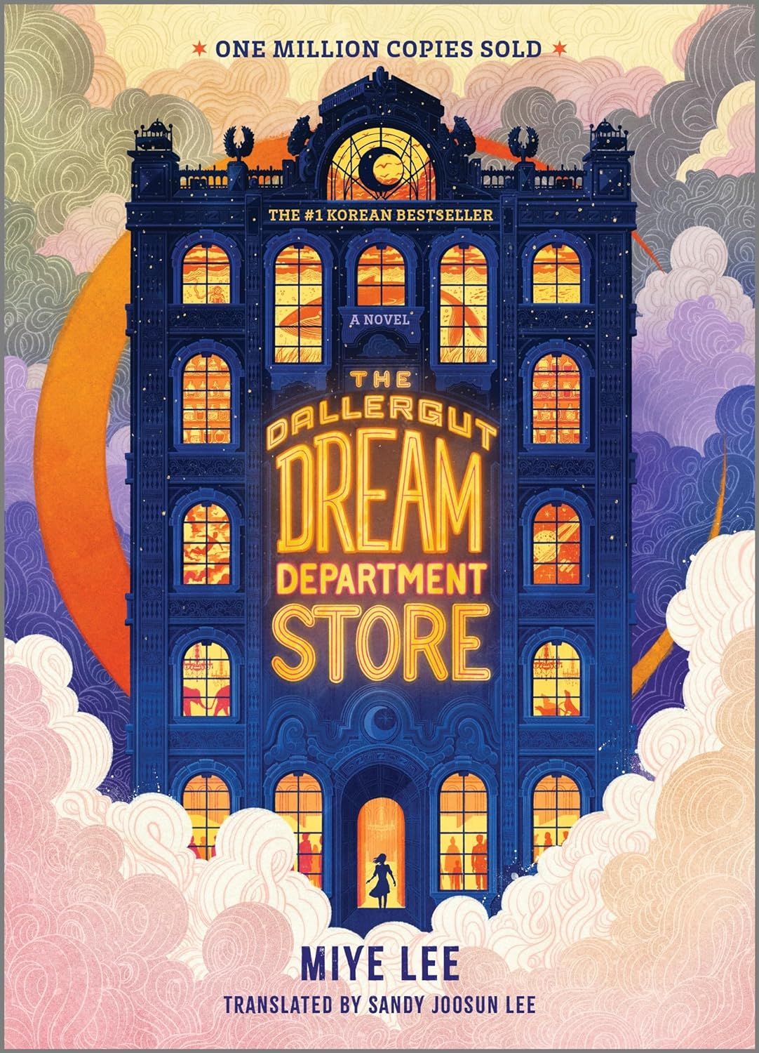

The Dallergut Dream Department Store by Miye Lee, translated by Sandy Joosun Lee, cover design by David Curtis, and art direction by Kathleen Oudit
This cover pairs so neatly with the Shepherd cover at the top of the roundup. But rather than a collection of magical doors, we’re invited into a world of magic behind windows. The dreamy color palate plays nicely with the title and makes it clear to readers this is a story they will be completely swept up in.
Lee’s book is a Korean bestseller and has a very different look in its original publication. As much as this US cover is excellent, can we take a moment to appreciate how stellar the range of international editions are? I’m especially digging the bright pink that looks like a UK edition in Spanish.
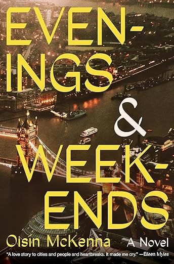

Evenings and Weekends by Oisín McKenna
At first glance, this cover is pretty straightforward. There’s London in the background, which is the story’s setting. But the thing that makes this cover one that belongs on the best of list is its clever placement of the title. The word breaks create a nice visual balance and the yellow font so nicely blends right into the background.
Several design lovers have included the UK edition’s cover among best book covers, but it’s actually comparing it to the UK cover which makes me appreciate how good the US edition is. In a moment where design leans into colorful blobs and illustrations that don’t necessarily stand out among their peers but pop on a screen, this is the kind of cover that manages to do both.


The Great State of West Florida by Kent Wascom, cover design by Jeff Miller
When is the last time you’ve seen a western cover like this one? It’s probably been a while. Add to it the bright pink background and you’ve got a memorable design, even and especially because of how many western tropes it shoves into a single image.


Gretel and the Great War by Adam Ehrlich Sachs, cover design by Alex Merto
The minimalist, flat illustration stands out in a world of covers with flat, minimalist illustration for its clever juxtaposition of the very feminine ballerina leg with the masculine war helmet. The neutral blue and the understated fonts for the title and author create even more intrigue for the story.


Honey by Isabel Banta
Speaking of book covers that are understated, Honey continues to catch my eye every time I see it because there’s not a whole lot to it. That simplicity is intriguing, and the shiny, throwback CDs against the bright pink background make the whole thing pop.
The intentional lowercase font for the title and author helps bring the focus to those CDs.
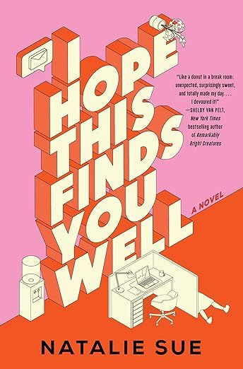

I Hope This Finds You Well by Natalie Sue, cover by Simeon Greenaway
When you look at the cover of I Hope This Finds You Well compared to the two covers immediately above, you see how the vibe shifts with a more maximal, centered title. And yet, what this cover does is use minimal color to create a big impact. The office space is empty, and while that’s eye-catching, it’s also slightly sinister—not only do we have the knocked-over plat atop the “e” in Hope, but we have what appears to be a dead body outside the cubical wall, too. It finds that person well, indeed. (That three-dimensional title font has a ’90s flavor to it, too, but in a way that also feels very contemporary).


In Tongues by Thomas Grattan, cover design by Alex Merto
The moment I saw this cover, sometime last year, I saved it because it’s so good. It’s got a vintage flavor to it with the font, the slightly off-white cover, and the styling of the title and author. And yet it also feels very contemporary with its split design. The bright pink contrasts nicely with the dog’s half-face and despite what are somewhat disparate pieces, the cover itself works as a whole. It’s evocative (and frankly a little gross in the best way with the dog slobber).
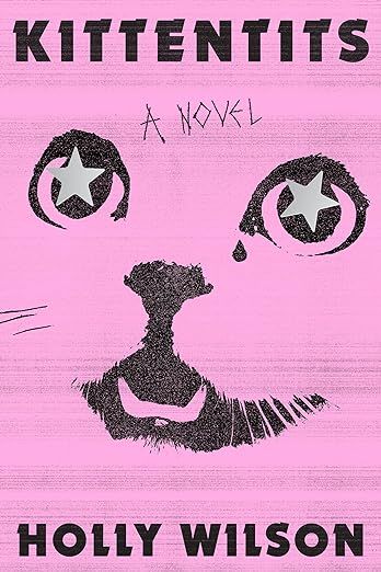

Kittentits by Holly Wilson, cover design by Eli Mock
The overly dramatic, oversized, and ridiculous-looking cat front and center is a theme for more than one of the best book covers of the second quarter of 2024. This one offers us a cheeky take on tits with the cat eyes, and frankly, between the bright pink; the cat face; the sharp fonts for the title, the author, and the words “a novel”; and the title itself, you have a quite basic cover elevated into something kind of hard to forget.


Little Rot by Akwaeke Emezi, Cover design by Sarah Bagshaw
It’s the neon colors that make the cover for Emezi’s latest novel pop. This is a take on the colorful blobs trend, except because that trend has faded, this manages to shine.
What’s especially interesting with this cover is just how different it is from the UK edition…which I might like a little bit more because it’s so distinct. Somehow, despite how different the covers are, they evoke the same feelings upon viewing.
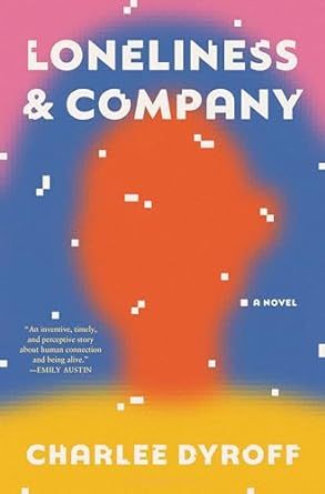

Loneliness & Company by Charlee Dyroff, cover design by Mia Kwon
It’s not quite a portrait and not quite an illustration. It’s also not quite complete and gives the perfect technological vibe fitting with the book’s contents. The ambiguity here is the selling point.
Interestingly, the 2025 YA book True Life in Uncanny Valley by Deb Caletti plays with a similar style and it’s also visually noteworthy.


Love Junkie by Robert Plunket, cover design by Oliver Munday
You don’t really need more explanation than a pair of underwear with the book title and author on the waistband to understand why this is so good.
If you do, it’s also the sharp contrast in the red briefs (boxer briefs, hard to really tell!) and the bright pink background.


Magical/Realism: Essays on Music, Memory, Fantasy, and Borders by Vanessa Angélica Villarreal
One word to describe this cover is busy. Another word, fantastical.
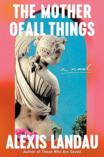

The Mother of All Things by Alexis Landau, Cover design by Arsh Raziuddin, art direction from Kelly Blair
This cover somehow manages to be both contemporary because of its color and font choices, while also feeling classic with our statue and view from what seems to be a window looking outward. It captures the essence of the book, and without even knowing what the book might be about, those who take on a mothering role just know this is a book about the unrealistic demands and challenges of motherhood.
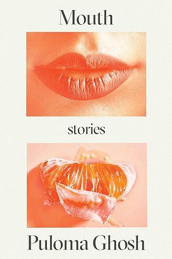

Mouth by Puloma Ghosh, cover design by Adriana Tonello
Watching body parts metamorphosize into food is a visual delight I can never get enough of, whether it’s meant to be funny or, in the case of this cover, slightly horrific. I’ll never look at a slice of (blood) orange the same way again.
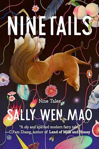

Ninetails by Sally Wen Mao, Cover illustration by Whooli Chen
I love fantasy book covers that lean into bright, vibrant colors and design. The energy in this cover is electric. It’s also got that magical, mythical fox, which we’re going to see again in the blink of an eye.


The Skunks by Fiona Warnick, cover design by Beth Steidle
Somehow, this cover leans into a long-time trend of being font-driven and doesn’t at all feel boring or overdone. Perhaps it’s because the cover looks downright tactile, like you could rub the letters against your face and feel the (presumably) soft tail of a skunk. The unassuming pink font used for the title and author still manages to pop—perhaps that little touch is why the book’s title manages to stand out in white.
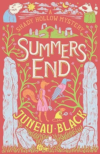

Summers End by Juneau Black, design by Christopher M. Zucker
Meet our second foxy cover star here!
A cozy mystery with an animal narrator deserves a book cover this cute, and Zucker absolutely delivers. What especially works is the muted red, juxtaposed with the bright greenery and the headstones/stone structures that provide grounding in the image.
This is not the first book in the series and the other covers are as enjoyable.
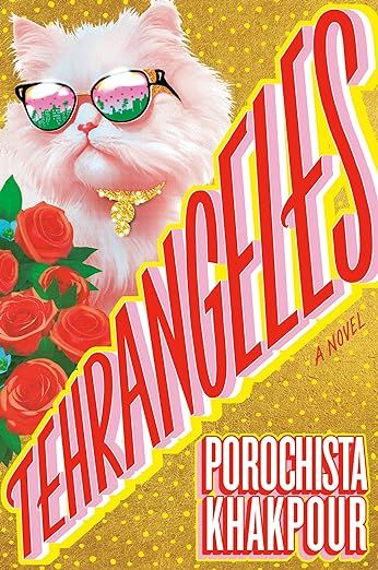

Tehrangeles by Porochista Khakpour, cover design by Philip Pascuzzo
Tehrangeles is tacky in the best possible way. A glam cat in sunglasses? A gold and glittery background? Roses? A title that takes up half the book cover’s real estate in vibrant pinks, reds, and yellows? Yes, please.
We really do need more covers that go all the heck in like this one, and I’m so glad we’re seeing so many animals getting their time in the cover spotlight like this.
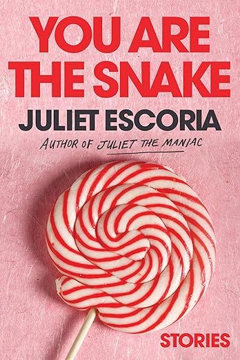

You Are The Snake by Juliet Escoria, Cover design by Farjana Yasmin
I’ve never thought of the word “snake” with a candy-striped lollipop, and now I will never untangle those two images. Again, we’re using red against pink, and it truly pops, as does the angry-feeling title with the gentle-feeling image. A+, zero notes. I want to read this book immediately based on the cover and title alone, which I rarely say anymore.
